Wednesday, 8 May 2013
Introduction
For my media coursework for AS i had got given a task to create a magazine. The first practise go of producing a magazine was to create a college magazine, this was to get to grips with using new technologies and how they work and also if they are effective for my style of audience. The final production for a magazine had to be based on music genres. To make it different to the college magazaine was that i have to also produce a content page and also a double page spread.
Tuesday, 30 April 2013
Actual page and evaluation of the college magazine

The actual magazine is a lot more sifisticated than the plan i made. With the magazine being more sifisticated it will attract a more older audience. I have used dark colours, but they do stand out to the audience due to the size and font. The background of the front cover is in the libary, this relates the magazine to be more related to collage, where as my plan was outside, which could have taken the relavance off being a collage magazine. I have also used mature language when producing my magazine, this also makes it more sifistictaed and also as a result the audience will feel more grown up when reading it. I have blured out the background of the magazine but made the person stand out more to the audience. To make my magazine look more fun and not to old for adult i used fonts that are not plain, i also placed them on a angle, by doing this it makes it look fun and enjoyable to read. By making the colours reflecting themselves it makes the cover page look like its all one and not like random features have just been placed on, which this could make it look unprofesional.
Evaluation
Richmond School would distribute my magazine product, this will be because the magazine revolves around them and wants people to know about Richmond School. The social groups for my magazine are teenagers that go to Richmond School 6th Form. The magazine represents this social group because it includes things that they enjoy doing such as social and proms. I have learnt about technologies from the process of constructing the product, such as using Photoshop and how to make my product look professional. Also using the camera to import the pictures that i had taken.
f the front cover is in the libary
Collage magazine plan
Plan of my collage magazine
This plan was made so i have an idea to how i want the layout of my collage magazine to look like. I used the main image from the internet, and produced this on a document called Photoshop. The image of a young woman will attract a more female audience due to there being a female on the front cover. The bright colours make it stand out and make the magazine more eyecatching. The font of the text used is called spirt and i took the image of the barcode from google images. The audience of the magazine would relate to a younger person as the colours do not reflect of being mature and would not attract the audience i am aiming for. The language used in the plan suggests it is targeted at younger people as slang is being used. The title uses slang, instead of saying the full work ' Gossip' the word 'GOSS' is used, this will atract people that use this sort of lazy language so this will make them feel more confortable buying it because they use the same langauge that is used in the magazine. With the price only being 50p this will make it more acceptable and more aligable for the specif audience which is younger and they will not want to pay lots of money for a magazine that they may not buy for in their spare time.

Monday, 29 April 2013
Collage magazine analysis ( CLASS)

- Blue, orange and white colours link together, not making the cover of all random colours
- Image and background took as a photo and not photoshopped making it look more pro and not edited to make the cornors of the image look sharp.
- All text is in detail, but not loads so it dosn't put people off
- Bold Writing
- Eye catching titile
- All text is on the left hand side
- editon date and price although the price is a bit expensive for students
Saturday, 27 April 2013
Collage magazine analysis ( Rambler)

- Bad quality picture as it has been photoshoped
- Cant really see the writing and it dosnt look detailed enough
- Blury picture and sharp edged making it loko unproffesional
- Blue background colour looks to bright so the colour takes all the attention away from the purpose of the magazine
- Random colours that dont link together also making it look unproffesioanl
- Title and phrases dont give a detailed meaning about the magazine which then may put people of buying it
Friday, 26 April 2013
Titles for the college magzine and opinions
CLASS!
- Its boring but with it being only one word it will be easier for the audience to remember
- It relates to collage and what you do when your there
- Its represent when teenagers enjoyed somthing so it could represent collage as fun and enjoyable
- It is the whole point and aim of being at collage to get good grades
- It sounds serious which could be a disadvantage because they dont want to read something that they get told by there teachers all the time so it will put the audience off buying and reading it
- Its an advanatge because it can be informational which some people may find intresting and a advanage of this
- It relates to collage and the whole idea of being there and to get the best grades as possible
- It could also represent how teenagers rate eachother physically
- It is sland which most teenagers use
- It could attract the audience to buy it because they will think loads of gossip and news will be incuded
- It also represents teenagers as they also gossip and this will encourage them to read and buy the magazine
- GOSS also takes the seriousness and boringness of exams and serious information away from the magazine which that could put teenagers buying the magazine
Exsiting front cover analysis - Research uses and gratifications theory Blumler and Katz
For my cover analysis i used Microsoft powerpoint to create these slides. I looked at 3 different cover of magazines and all 3 of them are different in some way. The top of the pops is aimed at younger children where as essence may be aimed at female teenagers or young female adults. Oasis looks like it is aimed at teenage boys that like the music genre rock. I can tell this by the colours and the way the page is layed out.
1. Top of the pops BBC front cover has bright pink and bright girly colours on, this means that the target audience they are trying to aim this magazine at is the younger girls aged between 7 - 11. The images on the front cover are singers that also aim their music at this age group and market area so this is more effective to the audience because it relates to the younger girls as they will find it more interesting to read as they know these singers. The page is full and there is hardly and blank spaces, this creates a energetic and powerful outlook of the magazine as BBC would want the magazine to reflect of the personalities of the target market as energetic, loud and bright spirtited. By using words such as ' fittest' represents the younger generations langauge. This is effective because it makes the front cover more personal to the reader, as they may also use this sort of language when with friends. The swirly writing almost create the font and layout of how girls write and the magaizne is reflecting of their target markets actions by doing so, this create a more pesonal feel to the magazine and then therefore this is going to make the target market ( young girls ) want to read the magazine.  2. Essence in relation to the first magazine front cover is completely different in sence of colour, layout and target market. You can see this because the colours are a lot lighter and more sifisticated so therefore this could mean that it is targeted at a more older generation of women aged roughly about 18 - 25. With beyonce being one of the most well known singers as the main image on the front cover then this instantly creates a more mature and womenly feel about what the magazine is going to be aimed on. The colours used are also plain but with the yellow text it still manages to stand out to become eyecatching. The colours represent to the main image as she is outside so therefore the text colours are going to have to meet that also to allow the front cover to look as one. With a sideline on the left hand side of the page ' Your Best Summer' is representing what clothes she is wearing. Beyonce is wearing only a little white top and this related back to the text as this is the sort of clothing she would wear whilst being in the summer seasons. With the target market being more mature then the main image is going to have to reflect of this is become successful. This have been achieved as her skin is glowing and she does not have a face full of make up which makes her look classy just like the aim of the magazine. By having beyonce as a main image on the magazine then the more mature readers are likely to want to read this also it could be aimed at teenagers also as her music is aimed at these groups also.
 2. Essence in relation to the first magazine front cover is completely different in sence of colour, layout and target market. You can see this because the colours are a lot lighter and more sifisticated so therefore this could mean that it is targeted at a more older generation of women aged roughly about 18 - 25. With beyonce being one of the most well known singers as the main image on the front cover then this instantly creates a more mature and womenly feel about what the magazine is going to be aimed on. The colours used are also plain but with the yellow text it still manages to stand out to become eyecatching. The colours represent to the main image as she is outside so therefore the text colours are going to have to meet that also to allow the front cover to look as one. With a sideline on the left hand side of the page ' Your Best Summer' is representing what clothes she is wearing. Beyonce is wearing only a little white top and this related back to the text as this is the sort of clothing she would wear whilst being in the summer seasons. With the target market being more mature then the main image is going to have to reflect of this is become successful. This have been achieved as her skin is glowing and she does not have a face full of make up which makes her look classy just like the aim of the magazine. By having beyonce as a main image on the magazine then the more mature readers are likely to want to read this also it could be aimed at teenagers also as her music is aimed at these groups also.
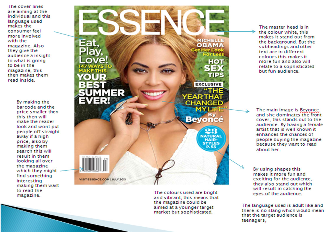
3. Oasis is aimed a completly different market to magazine front cover one and two. You can see this because of the colours used a dark but bright and stand out. The genre of the magazine by the look of the front cover is rock or metal. With the genre being rock or metal then the colours of the text relate to this as most lyrics in rock or metal music videos are about death of some sort. The red could represent blood and the black could represent death. By having these colours together then it relates back to the lyrics in the genre of music. The layout of this magazine is also completely different to number one magazine as there is text on the cover but the page isnt as full. This could represent a more plain audience as men sterotypically do not like to read loads of writing as this could put them off wanting to read the magazine altogther. The image on the cover page is of a man head and his facial expressions dont look happy, this could also relate back to the death in the lyrics of this sort of genre of music. The image is a close up shot which creates more emotion as you can see his facial expressions more closly compaired to the other 2 magazine covers. By having a plain grey, white colour behind the image and text could mean that it is aimed at a more mature male audience not suitable for younger boys. The logo stand out of the page and is secondly the most noticable feature, this sticks in the readers mind aswell as the main image. The main image is also wearing dark clothes which reflect in the genre but also in the cover its self, it creates an atmosphere which is dark and dull but the target audience which enjoy listening to that sort of music could realte to this magazine well. But you can hardly see his clothing as the shot is mostly aiming all the attention on his facial expressions and getting the point across that he is not a happy man.

Subscribe to:
Comments (Atom)