Mood Board
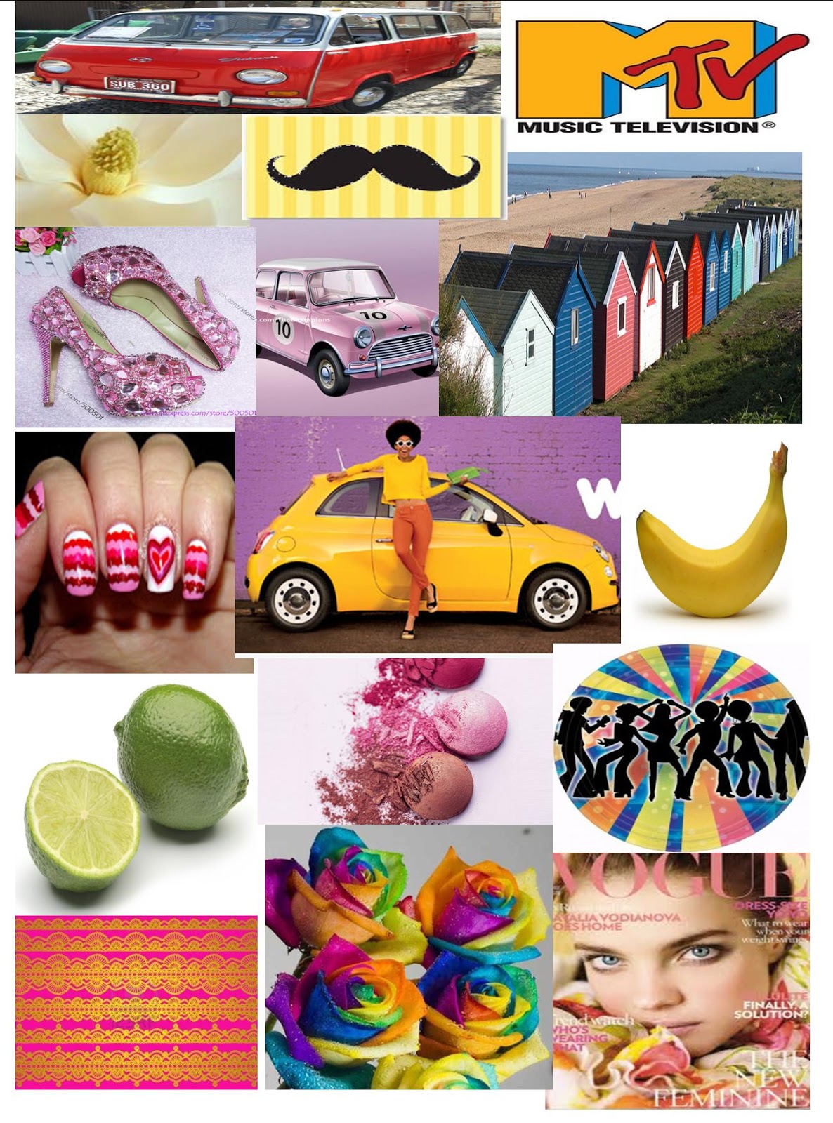
This is my mood board for my music magazine, i am using 1970's colours as i am wanting my magazine to be bright and eye catching. By using the bright colours it makes the theme of the pop music and the bright colours stand out and make the magazine more noticeable. The bright colours and the different shapes of each pictures varies and makes the product that i am going to be making realate to a specific theme. I have used the specific pictures as this is what i am wanting my target audience to be interested in pop music. There is a fashion style of wearing clothes that are relatively bright and noticeable, this is why i am producing my music magaizne in the genre and theme of pop. The images are representing a bright and enthusiastic person that enjoys being different and noticed.In the mood board there are also some nuetral colours this makes the magazine relate to older teenagers, it also represents class and being modern.
No comments:
Post a Comment