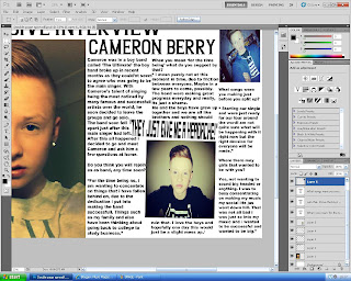
Step 1 was to create the headings, i did this by using the website 'Dafont.com' i used this website as i thought that all the fonts on Adobe Photoshop would not suit my page as they were plain and boring, and i wanted my page to be fun and different. The colour of the heading was in black and this stood out on the white page and this becomes more eye catching. I placed the headings as 2 parts this makes it original. I placed ' EXCLUSIVE INTERVIEW' on the right hand side as this was more important and would only make sence if it was to be read first than ' CAMERON BERRY' being placed on the left hand side which had to come after the exclusive interview part. I also placed them in different places of the page as i thought
Step 2 was to place the image, i used this image because i thought it showed the expression of cameron very well, which relates to the article. The close up shot also makes the page look more power full and also becomes eye catching and people want to read the article as they feel encouraged by the large image which takes up just under half of the page.
Step 3 was to add the text for the article, with the text relating to and interview i had to place the text in paragraphs for each question. This makes it easier to read and breaks the text up so it does not look to much which could put people off reading it.
Step 4 was to add an image in the middle of the article, this breaks the text up a bit which is good because it doesnt look to much text. It also adds character to the article and becomes more fun and interesting to read.
Step 5 was to add a quote heading in the middle of the article on top of the picture, this makes it relate to cameron who was being interviewed.


No comments:
Post a Comment