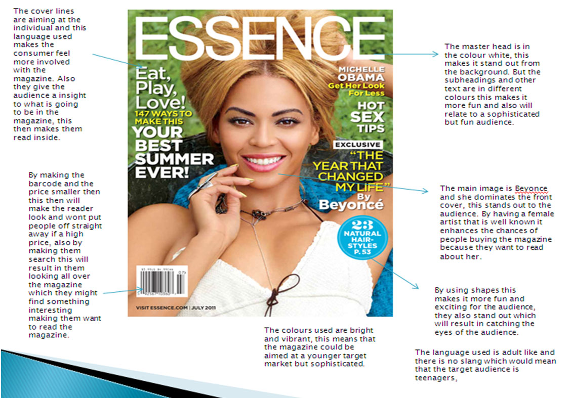
Tuesday 30 April 2013

Actual page and evaluation of the college magazine

The actual magazine is a lot more sifisticated than the plan i made. With the magazine being more sifisticated it will attract a more older audience. I have used dark colours, but they do stand out to the audience due to the size and font. The background of the front cover is in the libary, this relates the magazine to be more related to collage, where as my plan was outside, which could have taken the relavance off being a collage magazine. I have also used mature language when producing my magazine, this also makes it more sifistictaed and also as a result the audience will feel more grown up when reading it. I have blured out the background of the magazine but made the person stand out more to the audience. To make my magazine look more fun and not to old for adult i used fonts that are not plain, i also placed them on a angle, by doing this it makes it look fun and enjoyable to read. By making the colours reflecting themselves it makes the cover page look like its all one and not like random features have just been placed on, which this could make it look unprofesional.


Evaluation

Richmond School would distribute my magazine product, this will be because the magazine revolves around them and wants people to know about Richmond School. The social groups for my magazine are teenagers that go to Richmond School 6th Form. The magazine represents this social group because it includes things that they enjoy doing such as social and proms. I have learnt about technologies from the process of constructing the product, such as using Photoshop and how to make my product look professional. Also using the camera to import the pictures that i had taken.
f the front cover is in the libary

Collage magazine plan

                      Plan of my collage magazine
       This plan was made so i have an idea to how i want the layout of my collage magazine to look like. I used the main image from the internet, and produced this on a document called Photoshop. The image of a young woman will attract a more female audience due to there being a female on the front cover. The bright colours make it stand out and make the magazine more eyecatching. The font of the text used is called spirt and i took the image of the barcode from google images. The audience of the magazine would relate to a younger person as the colours do not reflect of being mature and would not attract the audience i am aiming for. The language used in the plan suggests it is targeted at younger people as slang is being used. The title uses slang, instead of saying the full work   ' Gossip' the word 'GOSS' is used, this will atract people that use this sort of lazy language so this will make them feel more confortable buying it because they use the same langauge that is used in the magazine. With the price only being 50p this will make it more acceptable and more aligable for the specif audience which is younger and they will not want to pay lots of money for a magazine that they may not buy for in their spare time.

Monday 29 April 2013

Collage magazine analysis ( CLASS)


  • Blue, orange and white colours link together, not making the cover of all random colours
  • Image and background took as a photo and not photoshopped making it look more pro and not edited to make the cornors of the image look sharp.
  • All text is in detail, but not loads so it dosn't put people off
  • Bold Writing
  • Eye catching titile
  • All text is on the left hand side
  • editon date and price although the price is a bit expensive for students

Saturday 27 April 2013

Collage magazine analysis ( Rambler)


  • Bad quality picture as it has been photoshoped
  • Cant really see the writing and it dosnt look detailed enough
  • Blury picture and sharp edged making it loko unproffesional
  • Blue background colour looks to bright so the colour takes all the attention away from the purpose of the magazine
  • Random colours that dont link together also making it look unproffesioanl
  • Title and phrases dont give a detailed meaning about the magazine which then may put people of buying it

Friday 26 April 2013

Titles for the college magzine and opinions

CLASS!

  • Its boring but with it being only one word it will be easier for the audience to remember
  • It relates to collage and what you do when your there
  • Its represent when teenagers enjoyed somthing so it could represent collage as fun and enjoyable
GRADE
  • It is the whole point and aim of being at collage to get good grades
  • It sounds serious which could be a disadvantage because they dont want to read something that they get told by there teachers all the time so it will put the audience off buying and reading it
  • Its an advanatge because it can be informational which some people may find intresting and a advanage of this
  • It relates to collage and the whole idea of being there and to get the best grades as possible
  • It could also represent how teenagers rate eachother physically
GOSS!
  • It is sland which most teenagers use
  • It could attract the audience to buy it because they will think loads of gossip and news will be incuded
  • It also represents teenagers as they also gossip and this will encourage them to read and buy the magazine
  • GOSS also takes the seriousness and boringness of exams and serious information away from the magazine which that could put teenagers buying the magazine

Exsiting front cover analysis - Research uses and gratifications theory Blumler and Katz

For my cover analysis i used Microsoft powerpoint to create these slides. I looked at 3 different cover of magazines and all 3 of them are different in some way. The top of the pops is aimed at younger children where as essence may be aimed at female teenagers or young female adults. Oasis looks like it is aimed at teenage boys that like the music genre rock. I can tell this by the colours and the way the page is layed out.

1. Top of the pops BBC front cover has bright pink and bright girly colours on, this means that the target audience they are trying to aim this magazine at is the younger girls aged between 7 - 11. The images on the front cover are singers that also aim their music at this age group and market area so this is more effective to the audience because it relates to the younger girls as they will find it more interesting to read as they know these singers. The page is full and there is hardly and blank spaces, this creates a energetic and powerful outlook of the magazine as BBC would want the magazine to reflect of the personalities of the target market as energetic, loud and bright spirtited. By using words such as ' fittest' represents the younger generations langauge. This is effective because it makes the front cover more personal to the reader, as they may also use this sort of language when with friends. The swirly writing almost create the font and layout of how girls write and the magaizne is reflecting of their target markets actions by doing so, this create a more pesonal feel to the magazine and then therefore this is going to make the target market ( young girls ) want to read the magazine.  2. Essence in relation to the first magazine front cover is completely different in sence of colour, layout and target market. You can see this because the colours are a lot lighter and more sifisticated so therefore this could mean that it is targeted at a more older generation of women aged roughly about 18 - 25. With beyonce being one of the most well known singers as the main image on the front cover then this instantly creates a more mature and womenly feel about what the magazine is going to be aimed on. The colours used are also plain but with the yellow text it still manages to stand out to become eyecatching. The colours represent to the main image as she is outside so therefore the text colours are going to have to meet that also to allow the front cover to look as one. With a sideline on the left hand side of the page ' Your Best Summer' is representing what clothes she is wearing. Beyonce is wearing only a little white top and this related back to the text as this is the sort of clothing she would wear whilst being in the summer seasons. With the target market being more mature then the main image is going to have to reflect of this is become successful. This have been achieved as her skin is glowing and she does not have a face full of make up which makes her look classy just like the aim of the magazine. By having beyonce as a main image on the magazine then the more mature readers are likely to want to read this also it could be aimed at teenagers also as her music is aimed at these groups also.
3. Oasis is aimed a completly different market to magazine front cover one and two. You can see this because of the colours used a dark but bright and stand out. The genre of the magazine by the look of the front cover is rock or metal. With the genre being rock or metal then the colours of the text relate to this as most lyrics in rock or metal music videos are about death of some sort. The red could represent blood and the black could represent death. By having these colours together then it relates back to the lyrics in the genre of music. The layout of this magazine is also completely different to number one magazine as there is text on the cover but the page isnt as full. This could represent a more plain audience as men sterotypically do not like to read loads of writing as this could put them off wanting to read the magazine altogther. The image on the cover page is of a man head and his facial expressions dont look happy, this could also relate back to the death in the lyrics of this sort of genre of music. The image is a close up shot which creates more emotion as you can see his facial expressions more closly compaired to the other 2 magazine covers. By having a plain grey, white colour behind the image and text could mean that it is aimed at a more mature male audience not suitable for younger boys. The logo stand out of the page and is secondly the most noticable feature, this sticks in the readers mind aswell as the main image. The main image is also wearing dark clothes which reflect in the genre but also in the cover its self, it creates an atmosphere which is dark and dull but the target audience which enjoy listening to that sort of music could realte to this magazine well. But you can hardly see his clothing as the shot is mostly aiming all the attention on his facial expressions and getting the point across that he is not a happy man.

Thursday 25 April 2013

mood board


Mood Board


This is my mood board for my music magazine, i am using 1970's colours as i am wanting my magazine to be bright and eye catching. By using the bright colours it makes the theme of the pop music and the bright colours stand out and make the magazine more noticeable. The bright colours and the different shapes of each pictures varies and makes the product that i am going to be making realate to a specific theme. I have used the specific pictures as this is what i am wanting my target audience to be interested in pop music. There is a fashion style of wearing clothes that are relatively bright and noticeable, this is why i am producing my music magaizne in the genre and theme of pop. The images are representing a bright and enthusiastic person that enjoys being different and noticed.In the mood board there are also some nuetral colours this makes the magazine relate to older teenagers, it also represents class and being modern.

Wednesday 24 April 2013

Audience profile

The audience for my music magazine will be teenagers, but the age of 16-18 girls . My music magazine is going to be on the genre of pop. I am wanting to include the latest music songs that the people of the 21 cenrtery know well. My ideal audience would be a teenage girl that loves listenting to the latest tunes and take great interest in the artists life aswell. They would also like to read the latest gossip about them and also look at pictures of them throughout the magazine. I am wanting my magazine to be sucessful so i will investigate to what other areas i could include in my magazine to be successful for my target market audience to enjoy reading. This can include large images and not to much text as this could put the reader off reading, also i could use different sorts of language such as slang and puns to engage my audience to read further. By using this langauge it will make the audience feel like the magaizine is specifically aimed at them and this will make them feel invovlved with the magazine that i will produce.

By looking at existing magazine products i had relised that they all had bold heading that had a theme colour that represented the audience they where aiming at. Such as girls had bright coloured which the majority of the time was pink or purple, whereas boys where blue, green or black. The audience that i am aiming my magazine at are located all over the country. The magzine will be relativly cheap so as a result this will make it more varied for a larger audience appeal. With my audience being a young age group and not everyone of them may have some sort of imcome then i am going to make my magazine afforadable to that it does not disadvanatge some of my audience. I am wanting my audience young teenagers that have a great interest in music and enjoy listening to sound tracks that is popular to people in the same age groups.


Tuesday 23 April 2013

Production plan

For my magazine i am going to have to think about all the different areas for my magazine to become successful to the audience i am aiming for. So i am going to have to think about the demographic aspects which are whos is going to be my audience? what age? Which gender? geographic aspects and also are my audeince in employment so that they can purchase the magazine. Also content overview this means what will be in the magazine, such as features and why they are there and also why are they important for my production analysis.
I am also going to have to think of my competitors and what i have to do to relate my magazine to existing ones alsowhat other magazines are like, is it unique. what is my USP unique selling point. Advertising is also another important aspect of my magazine becoming succesful as i need to think who are my  advertisers and why? What is the content to advert ratio and who would advertise my magazine.

Monday 22 April 2013

Music magazine title name ideas


These are some names i decided to think about using for my music magazine. I am wanting my title to be bolf but colourful, but not to colourful so it makes my music magazine change the age group i am wanting to aim at. I have used names that are plain and simple so that they stick in the readers head. I have also on some put a 'Z' this is so that it relates to my audience which are teenagers and it relates by the slang. The one i have chosen to use is ' listen UP!'. I have used this because it is plain and simple but also sends a message and realtes to music.

Publication Plan

The name of the Magazine is called Listen UP!


Name: ListenUP!

The positioning statement or theme is Pop music.

The frequency of the publication will be monthly.

The price of the magazine is £1.00

The magazine will be distributed around Richmond sixth form to all the sixth formers and also people in Richmond secondary school.

The rationale of my magazine will be aimed at people of the same agr groups as me, this is teenagers at the ages of 16-18. I am going to put short paragraphs in my magazine this will not put the reader of reading it and smaller pieces of imformation are much more snappy than long pages of text. I am relating my magazine to this age group as i know what osrt of things the age group look for when reading a magazine. I am wanting my magazine to be simple and i am going to put in things such as fan reviews and also singer interviews.

The style of my magazine will be informal due to the age group i have chosen. I am wanting to relate my audience langauge to my magazine as this will make them feel more involved when reading. The magazine is going to follow certain bands and singers and this will make it more easy to read throughout.


Regular contents:
- Jessie J shaving her head for comic relif
- The saturdays no.1 single with sean paul
- One directions real thoughts on fame and girls
- N-dubz reuniting
- The wanted confirm their new single
- Rita ora ( how we do party)

Sunday 21 April 2013

Front cover mock up

For me to be able to see what and how i wanted my front cover to exactly be like then i had to have some idea to what i wanted the layout and sizes to be. I had drawn a mock up and i also did a digital mock up on the computer on Adobe Photoshop. When making my mock up i was having to think about how i wanted my page to appeal to the audience. I wanted bold headings and master headings which caught the eyes of the audience. I did not want any pictures on the front cover as i thought this would make the magazine relate to a more younger audience that i wanted to appeal at.
This is a digital mock up of my front cover for my music magazine, this shows a simple layout to where i want things to be placed. The banner at the top of the page will be bold and will simply have a short catchy phrase which will encourage the audience to want to read. The master head is going to be bold and eye catching this is so that the attention will be brought to the magazine as a whole. The cover lines are also going to give clues and tasters to the audience to what they will find inside and this will then therefore make them want to read whats inside. The main cover line is the main article which is in the magazine and this will also be an eye catcher. The main cover line is the main story which relates mainly throughout the magazine. The main image is mostly always related to the main cover line aswell. The main image for my magazine will also take up all of the page and will stand out. I am wanting to use aa picture of the person i am concentrating my main article on within the magazine. The date and price of the magazine also need to be on the front cover. In my case i am going to place them either side of the main image. This just covers  blank spaces, as blank spaces will not attract people and would also make the cover look boring.

Saturday 20 April 2013

photo shoot

This is my main image i am going to be using for my front cover. I have chosen to use this image as all the colours mix well together. The colour of the brick blends in with the models hair colours. Whereas further down the brick it becomes lighter to whereas so does the clothing of the model. After i had chosen the picture i had found that there was a stain on the jumper, it was easily solved as i used Adobe Photoshop to blend it in so it become invisible. I also like this picture as the background is plain but still has character and a theme.
This image is a good image as it represents teenagers in modern years. This image also shows the characteristics that will be in the magazine and also will make the reader feel like they interacte with the magazine as this is how they behave.There is also a variety of colours which make it stand out and to become eye catching.
This image that i had taken i did not use in my magazine as i felt like the quality of the picture wasnt suitable. With the bad lighting that was available it had gave the image a bad colour effect which made the picture look blury. But what i found effective was the background of the image, this is because the main article was about him being interviewed in his own home. By relating this to the main article made this picture really effective. With the clothes that the model is wearing stands out then it makes him more noticeable in the picture but also blends in at the same time. The dark colours goes really well with the pail and nuteral colours of the background. The model is also standing casual, by him posing like this also relates back to the main article to him being interviewed in his own home.
I really like this picture as the colours of the image are really dark but the image overall is really bright and eye catching. I wanted the image to be really dark as it relates to the main article were there are sad and depressing bits, but the bright, circluar parts of the image represent the hope and the good bits of the main article. I had taken this photo in a dark room and put a circle object around the camera lence togive the circle effect in the dark when the flash on the camera came on. This is really effective because it drags all the attention of the image on to the model.
I really like this photo but there are points to where i dislike. As i had taken this photo with a camera and made the angle look like he was taking a self taken photo, the original photo i had taken before editing the colours had been delete by accident. Also the window in the background does not give it a profesional look. But on the otherhand it relates to the main article of him being in his own home. The close up shot which was taken drags the attention to the models fearures of the face and expression.

Friday 19 April 2013

front cover post

For my front cover image the theme was 1970-1980's. I decided not to go along with this as i found it hard to find props to make my cover image this theme. So later in the production of my music magazine i have went for a simple image of my brother Cameron, he is on the background of a brick wall. The theme for my music magazine is pop but the music that still relates to both genders. In the music magazine i am going to have bands and groups for males and pop singers for females. This is why i have chosen a dark coloured image. The sort of bands that i am going to include in my music magazine are groups such as: Pretty Wreckless, Lady Gaga and The Wanted.

The image for the front cover:
The front cover image is on a plain, brick wall. This makes the person look more noticeable and stand out more. After i had taken the picture i had noticed that there was a stain on the jumper he was wearing. For me to be able to use the image i have had to get rid of the stain. I did this by use the clamp tool on AdobePhotoshop. This then removed the stain and was no longer viseable.


For the text i am going to use white font colour. This is because the white will stand out more and will then not blend in to much with the background as this may make the title not noticeable. I am showing on this print screen me using on AdobePhotoshop choosing the colour white for my master head.


The font for the masterhead i have chosen is bold and stands out, this will catch the readers eye. The name of the font is called Stencil. In the print screen it will show my choosing the font and the font size which is 400pt.
  
This is my front cover for the music magazine. I have put no colour on yet as i am struggle to choose, this is due to the different colour contrasts with the wall and the jumper of the model. I am sticking with the colour white for the master head, this is because it stands out and when i add colour it will be different and not be all one colour, as that could make it boring and unattractive. I have changed the font of the master head. I had found the font from a website called 'www.dafont.com'. I could not find a font that i wanted on Adobe Photoshop so i decided to use one from the website above.

Images
I am not going to use images on my front cover apart from my main image, this is because i want it to aim at a older teen age. Also by placing loads of pictures on the front cover may make the magazine look tacky and miss lead the type of audience i am aiming for. 
The final colours i decided to use where orange and white with a drop back shadow. The drop back shadow made the font stand out more which then this makes it more eye catching.


Monday 15 April 2013

Existing content pages


Existing content pages from
selinaberry5

I have researched existing content pages of music magazines, to give me an idea to what features are on the page and what effect they have on the reader. I did this research because i want to be able to relate the features to my magazine, but also put a twist on them to make them my own to become original and unique.
Below is the link to a slideshare of the research i did into exisiting content pages for music magaiznes.

Sunday 14 April 2013

Content page Mock up

For my content page mock up i drew a page by hand roughly to give me an idea to what features i wanted where. I did not have enough time to create a digital mock up as i found that time was limited.
This is the image i had taken to place on my blog. I wanted a title to make the page look professional and also i found that in exsiting content pages there was always a title. The colums are on the left hand side of the page this is because it is proven to know that people read from left to right. Therefore i did this so that the most important features on the page are noticed first. I had also placed images on my content page because i found that i did not put any on my front cover and also in exsiting contents there is also nearly images. This makes the magazine look fun and not to boring which may put people off reading it. I had also put an editors letter, this is not always essential but i did place one on my page because i want it to be personal to my audience. The boxes on the images are on because they are the main articles and this makes them stand out more to the audience
The changes that i made to my content page because i started to produce the page and found that more features suit the content of my magazine better to fill more space up, so in result it makes the page look more interesting. I had placed 2 sub heading for 2 different collums, this breaks the page up and will not look to much text to result in my audeince not wanting to read as they may feel it is too much. I had also places a picture of my front cover on the bottom right hand corner, this will make the reader remember the front cover and it will stick in their mind.
.

Friday 12 April 2013

Content page production steps

For my content page i had to think about features from exsiting magazines but also put a unique twist on to make it original.
This screen shot is showing the first step of my production, and this was to choose the colour of the background. I wanted to use a colour which was similar to the text on the front cover. As i found that the same colour which is on my cover lines on the front cover was going to be too bright for the background of the content page and this would have over powered the page and would have made it look cheap and tacky. Because i wanted an orange colour i decided to go for a more pail, and by choosing this it hasn't over powered the page and blends in with all the other features.
Step 2 was to choose the heading of the page. I decided to go for a bold text and the colour relates to the background of the bricks on the front cover. I wanted my magazines to have some sort of colour scheme throughout the magazine for it to all relate together. 

Step 3 was to add the boxes where the sub heading went into, i had to make this bold as they needed to stand out from all of the other text as they were important to direct the reader. I used a bold font to do this so it became more eyecatching and the colour of the sub heading is in black and this stands out from the vibrant orange. 
The boxes that the sub headings are in are in a rectangular shape, i used this shape as i thought it related to the shape of the bricks on the front cover image. This makes it more unusual and more of my own creation. 
Step 4 was to add the columns, i placed the columns on the left side of the page. I did this because i thought that the majority of readers read from left to right so therefore i put the most important writing on the left side. The column text is in a size 17 as i wanted to add a little line about the column to attract the audience on a question. This would then make the reader want to read as they feel encouraged. 


Step 5 was to add a editiors letter, i did this because i felt that it would make the page more personal to the reader. I also did this because i thought that it would fill up blank space which would then make my page look boring and then wouldn't attract the readers.  


Step 6 was to add a few images in the left top side of the page, i did this because i thought that it would make the page look more interesting due to the fact i did not put any on my front cover. This would then encourage people to want to read them pages as those 3 pages are the only ones with a number, this then makes it look like they are the main articles. 


Step 7 was to add a little photo of the front cover, this makes the front cover stay in the readers mind and also will make them remeber which could mean that then if there was another issue to be released then they would feel encourages to want to buy another of LISTENUPS! magazines. 

Thursday 11 April 2013

photo shoot

This is my main image i am going to be using for my front cover. I have chosen to use this image as all the colours mix well together. The colour of the brick blends in with the models hair colours. Whereas further down the brick it becomes lighter to whereas so does the clothing of the model. After i had chosen the picture i had found that there was a stain on the jumper, it was easily solved as i used Adobe Photoshop to blend it in so it become invisible. I also like this picture as the background is plain but still has character and a theme.
This image is a good image as it represents teenagers in modern years. This image also shows the characteristics that will be in the magazine and also will make the reader feel like they interacte with the magazine as this is how they behave.There is also a variety of colours which make it stand out and to become eye catching.
This image that i had taken i did not use in my magazine as i felt like the quality of the picture wasnt suitable. With the bad lighting that was available it had gave the image a bad colour effect which made the picture look blury. But what i found effective was the background of the image, this is because the main article was about him being interviewed in his own home. By relating this to the main article made this picture really effective. With the clothes that the model is wearing stands out then it makes him more noticeable in the picture but also blends in at the same time. The dark colours goes really well with the pail and nuteral colours of the background. The model is also standing casual, by him posing like this also relates back to the main article to him being interviewed in his own home.
I really like this picture as the colours of the image are really dark but the image overall is really bright and eye catching. I wanted the image to be really dark as it relates to the main article were there are sad and depressing bits, but the bright, circluar parts of the image represent the hope and the good bits of the main article. I had taken this photo in a dark room and put a circle object around the camera lence togive the circle effect in the dark when the flash on the camera came on. This is really effective because it drags all the attention of the image on to the model.
I really like this photo but there are points to where i dislike. As i had taken this photo with a camera and made the angle look like he was taking a self taken photo, the original photo i had taken before editing the colours had been delete by accident. Also the window in the background does not give it a profesional look. But on the otherhand it relates to the main article of him being in his own home. The close up shot which was taken drags the attention to the models fearures of the face and expression.

double page spread research


Wednesday 10 April 2013

Double page spread mock up

This is a hand drawn page of my double page spread mock up, i had also decided to do this as i wanted a rough idea to how i wanted it to look in my final production. The heading and the sub heading are both at the top of the page but the heading is in the right hand corner as this is the first important piece of information the reader had to read, and the sub heading is at the left hand side. By  placing them in different sides of the page dosnt just fill the page up but it also makes it look different and interesting. The image is very large as it takes up half the left hand page up, this is effective because it drags attention to the page and will encourage people to read the article, which is the main purpose of the double page spread. I also placed a small image on the page to make it look more fun and not to serious for my audience.
When producing the double page spread i had made changes and these where i put a bold quote in the midde of the article for it to look different and orignal. I had also put another small image undernearth the quote, this results the article being persoanl to the person in interviewed.

Tuesday 9 April 2013

Double page spread production steps

I have made a double page spread which comes off the theme of orange and brown colours, i have done this because i want this page to stand out more than all the rest and by using a different colour scheme it would then make it look different.
Step 1 was to create the headings, i did this by using the website 'Dafont.com' i used this website as i thought that all the fonts on Adobe Photoshop would not suit my page as they were plain and boring, and i wanted my page to be fun and different. The colour of the heading was in black and this stood out on the white page and this becomes more eye catching. I placed the headings as 2 parts this makes it original. I placed ' EXCLUSIVE INTERVIEW' on the right hand side as this was more important and would only make sence if it was to be read first than ' CAMERON BERRY' being placed on the left hand side which had to come after the exclusive interview part. I also placed them in different places of the page as i thought
that it would take more room and then wouldnt look dead space which could be boring and dull.


Step 2 was to place the image, i used this image because i thought it showed the expression of cameron very well, which relates to the article. The close up shot also makes the page look more power full and also becomes eye catching and people want to read the article as they feel encouraged by the large image which takes up just under half of the page.


Step 3 was to add the text for the article, with the text relating to and interview i had to place the text in paragraphs for each question. This makes it easier to read and breaks the text up so it does not look to much which could put people off reading it.


Step 4 was to add an image in the middle of the article, this breaks the text up a bit which is good because it doesnt look to much text. It also adds character to the article and becomes more fun and interesting to read.


Step 5 was to add a quote heading in the middle of the article on top of the picture, this makes it relate to cameron who was being interviewed.

Monday 8 April 2013

Audience feedback and changes that i made

Front cover

This is the front cover to which was going to be my final copy. I decided to do a audeince feedback and i decided to ask them questions about what they thought my magazine was like and what changes i could do to improve my magazine.
I asked the questions:
  1. What do you overall think of my magazine
  2. How do you think i could improve
  3. What do you like about the magazine
  4. What do you dislike
  5. What do you look for in exsiting  magazines
These are the results that i got back from 5 people i asked.
Sophie:
1. Good, but i think that it could be more eye catching
2. I think it could be improved my adding more colour and also images to which would make the page look more interesting.
3. I like the background of the image which is a wall and this makes it original.
4. I dislike that there is no images and the white colour looks really boring.
5. I look for colour and images which catch my eye and attract me to read the magazine.
Beth:
1.I think that the image used is really good as it takes up all the page and makes it stand out
2. You could improve it by adding colour and also more text or images in the places which have nothing in as this makes it look dull and empty.
3. I like that the image is really eye catching and that the text is in different angles as this makes it more intereesting.
4. I dislike how the colour does not make the magazine look fun and colourful and i think it could benifit the magazine if there is more colour.
5. I look for text which stands out and also eye catching cover lines which will attract me to read the magazine.
Amy:
 1. I love this magazine as i think it represnts the audience really well. You have used a image which relates to your target market.
2. You could improve this by adding text in the blank areas to make the page look more full.
3. I like the image as it fills up the whole page and i love the brick wall as this also represents your target market.
4. I dislike the white cover lines as i think it dosnt make the masterhead stand out as they blend in together.
5. I look for a bold master head which grabs my attention in exsiting magazines.
Jake:
1. I think this magazine relates well to your target audience and i think it attracts different markets aswell.
2. You could improve this magazine by adding more colour which make it more eyecatching and fun.
3. I like the image and the model goes well with your market audience,
4. I dislike the white coverlines as this makes the page look boring and dull.
5. I look for images which relate to my audience as i feel it is important to make the page relate to who your market is.
Andy:
1. I think that this magzine is really effective as the cover lines attract the audience as they are at a funny angle which makes the reader have to concentrate on what they say.
2. You could improve this page by making the banner look more interesting as this is also one of the main features which attracts the audience.
3. I like the way the cover lines are layed out and they are not just straight as this could make the page look boring.
4. I dislike how all the colours are the same it makes the page look quite boring which would not attract me as a buyer.
5. When looking at exsiting magazines i look for colours and images and bold master heads and cover lines which encourage me to want to read the magazine.


After asking these 5 people which are in the market group i am aiming my magazine at helped me to improve my magzine as it gave me the ideas anhd thoughts to which they look for in magazines. I can relate to this and make my magazine to how they feel and want it to look.
This is what i have produced to make my magazine relate to what i had based the questions on. I have added colour to represent the fun and hype of my target audience. But i have also left some white text in which this dosnt make the page look to bright which may make it look tacky. The model also stands out more from the background due to the colours refelcting of the light colours of his jumper. I have also coloured in the words to which i think are important on the cover lines, this is going to attract the audience to them and make them encouraged in reading the magzine. I have used bright colours to represent my audience. This has been done by using bright colours as it represents my audience being fun and hyper. I have also wanted to use the colour orange as i think it blends in well with the brick wall and also the red of the models hair. This makes the magazine blend together to give it a whole feeling.

Saturday 6 April 2013

Evaluation- In what way does your media product challenge forms and conventions of real magazine products?

For my magazine i was aiming for my magazine to have features that grabbed the audiences attention. So by doing this i made my title bold but a plain colour.The title is called 'LISTEN UP!' this title comes across to the audience as an order so therefore people will want to read inside. In the research i did the titles are all one word, i did not want to do this because i wanted magazine to be original and unique. The main image of the model was going to be placed right in the centre of the page and was going to take up all of the page, but i left room above the head to place my masterhead, this is were most titles are on music magazines.

LISTEN UP! is the master head for my music magazine, i did not want my title to be colourful but i did want it to stand out and also to be noticeable. Whereas when doing my research i found a similuar masterhead to the one i wanted. Notorius is a masterhead for a music magazine and the style still screams out to the audeience even though there is no colour. I wanted my masterhead to reflect on the genre i am wanting to create and by doing that i should think about the style of music i am wanting to base the music magazine around. Also want my target audience to be related within the magazine. I did not want to add colour into the masterhead as i thought that the black outline was still very demanding from the background which was the brick wall.
Mise en scene
With my magazine not being well known then therefore i need to concentrate on what the magazine is going to look like and how it is going to attract and appeal to my audience. The model i used for my magazine was an ordinary boy that was posing on a plain brick wall background. I wanted him to wear casual but smart clothing such as a new york jumper and jeans, this makes the magazine look relaxed and aimed at my audience to whati think they typically wear. I wanted him to wear clothes that stood out on the plain, dark wall, and he did this because of the cream jumper he wore. He is stood casual and the pose of him looking away is a typical conventions of the music magazine but i like this as i want my magazine to be original and unique. I want my magazine to be different so that it stands out from other competitors which are aiming the same goals as me. The lighting of the image is quite dark but this makes the quality of the image a lot better as it makes the model stand out more, this is what i am aiming for as he is one of the main features of the cover. The colour of models skins while looking at other magazines is quite bright and this leads to me that this is a typical convention and so as a result i am wanting my magazine to be different. By doing this i choose a model with different skin, the model i chose had freckles which made this more unique and different to other magazines.  The cover lines need to stand out as they are another main feature of a magazine especially if there is a lot going on in the background which could take the attention of the cover lines to be taken away. So i made them a bright orange which made them stand out and catch the audiences attention.
This is the image i used for my main picture on my double page spread. The mise en scene is bright, and catches the eyes of the audience, it can also come across to be like old fashioned. The close up shot also makes the image stand out more than it would if it was an ordianry long shot. The close up shot also allows the audience to see the expression on the models face which this in result of that gives the page character. The second image was also on my contents page and also on my double page spread. I asked him to wear dark clothes as this goes with the dark effect of the image which was taken. The bright white writing on the jumper stand outs within the darkness so this is another effect i liked. The bright circle also gives the image the light of hope feeling, and this is effective as the article in the double page spread is about his difficulties in life at the moment, so therefore there will be light for hope. Both images do not have an over busy background as they are plain and simple. The result of the background being plain is that it makes the model, the main feature of the image stand out more. A plain background could also mean that they just live a normal, ordinary life, so i made this across by taking a picture in their day to day enviroment.
This images of the woman having a picture in the dark is where i got the idea from, i found that even though the picture was in the dark it still made the page and image stand out from the reflection of the skin. IN addition to this i can therefore see that the image is a convention of a real media product so i am pleased with the turn out.
Models and people i used
For my magazine to be successful and to attract people to read it then i need to make sure that i use the right type of people that reprsent the genre of my magazine. The models i used for my magazine were ideal as i thought they played their roles really well, and this then made my magazine fit in well with the specific genre i was wanting. The person i used for the images where the simular age of the target audience i am wanting. I had used 3 models they all had different purposes to meet the purpose of my magazine. The model i had used on my cover page had a purpose for attracting the audience to read the magaizne, whereas the other two didnt have much of a role like the main person. The other two in the same picture had a role of creating personality to the magazine, representing teenagers in the modern centry.